ABOUT THE PROJECT
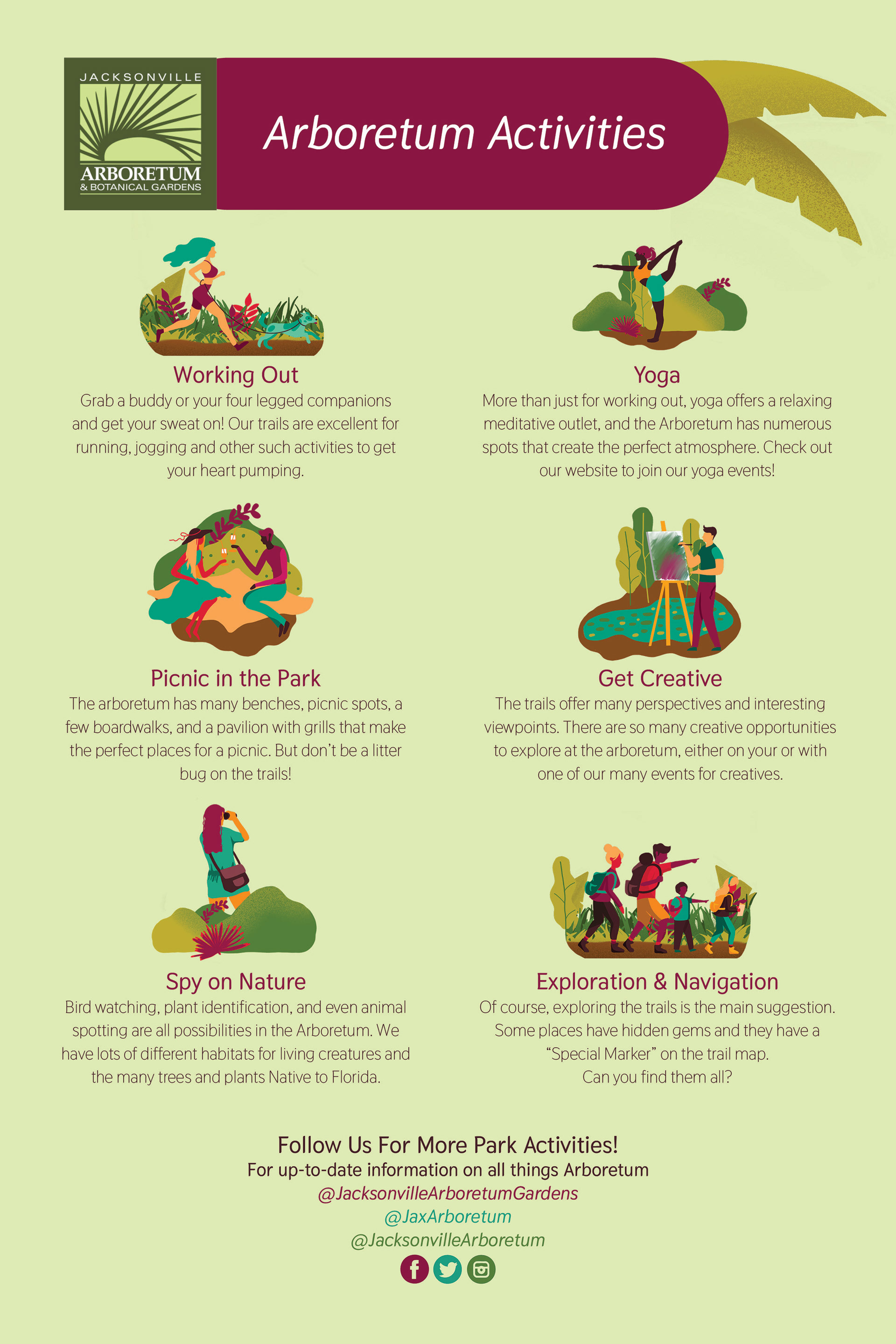
The Jacksonville Arboretum and Botanical Gardens has a vibrant appeal with lush greenery and a slew of natural Florida habitats and foliage. The many trails and unique features within the Arboretum inspired an equally vibrant and inviting redesign of the brochure and signage.
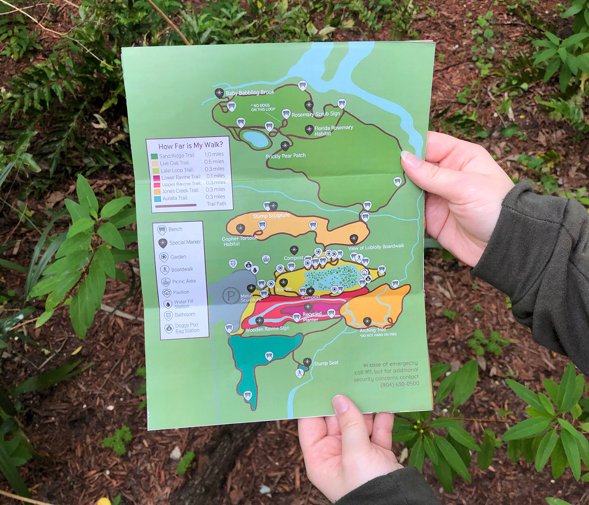
FORMAT & FUNCTION
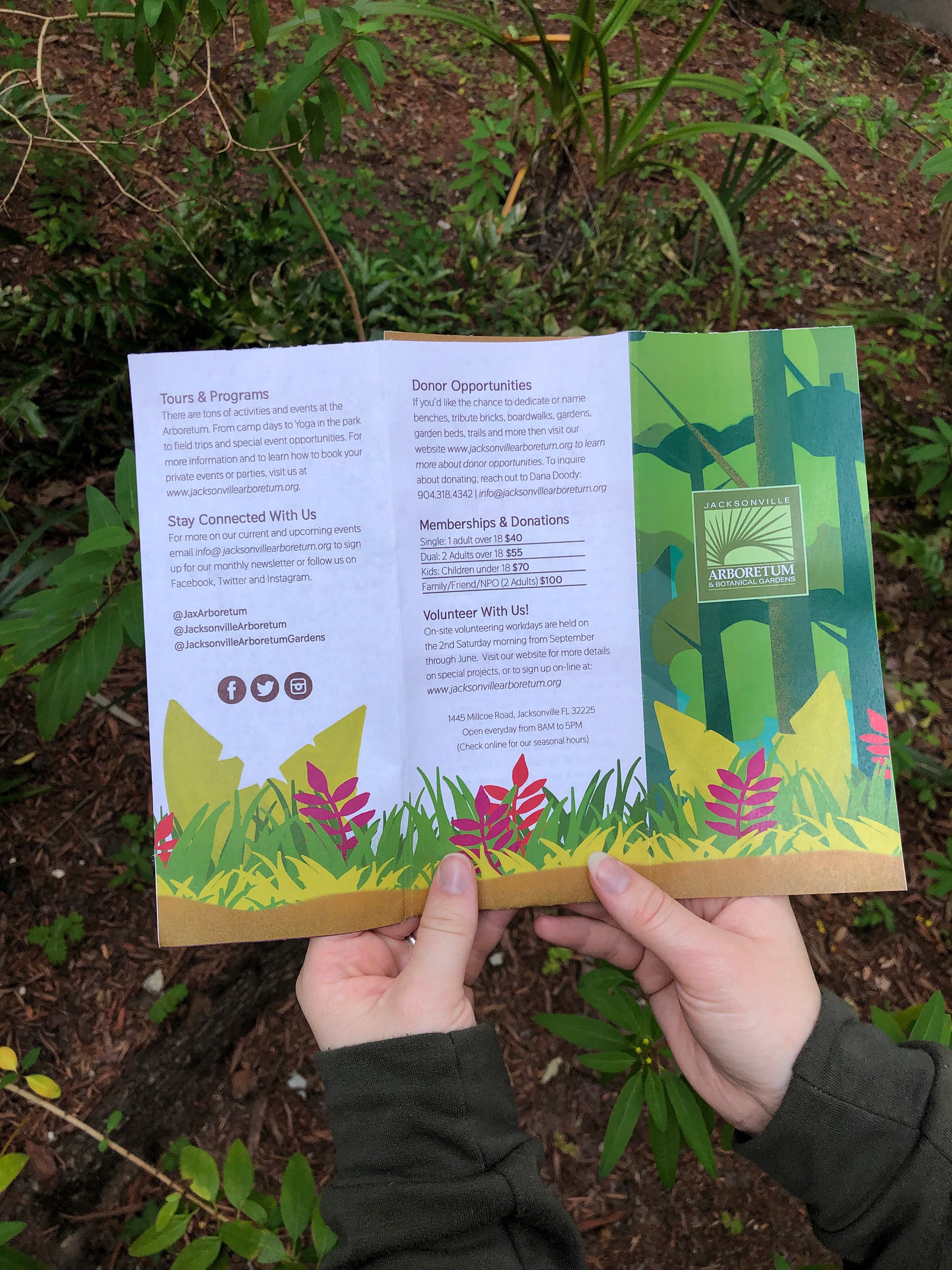
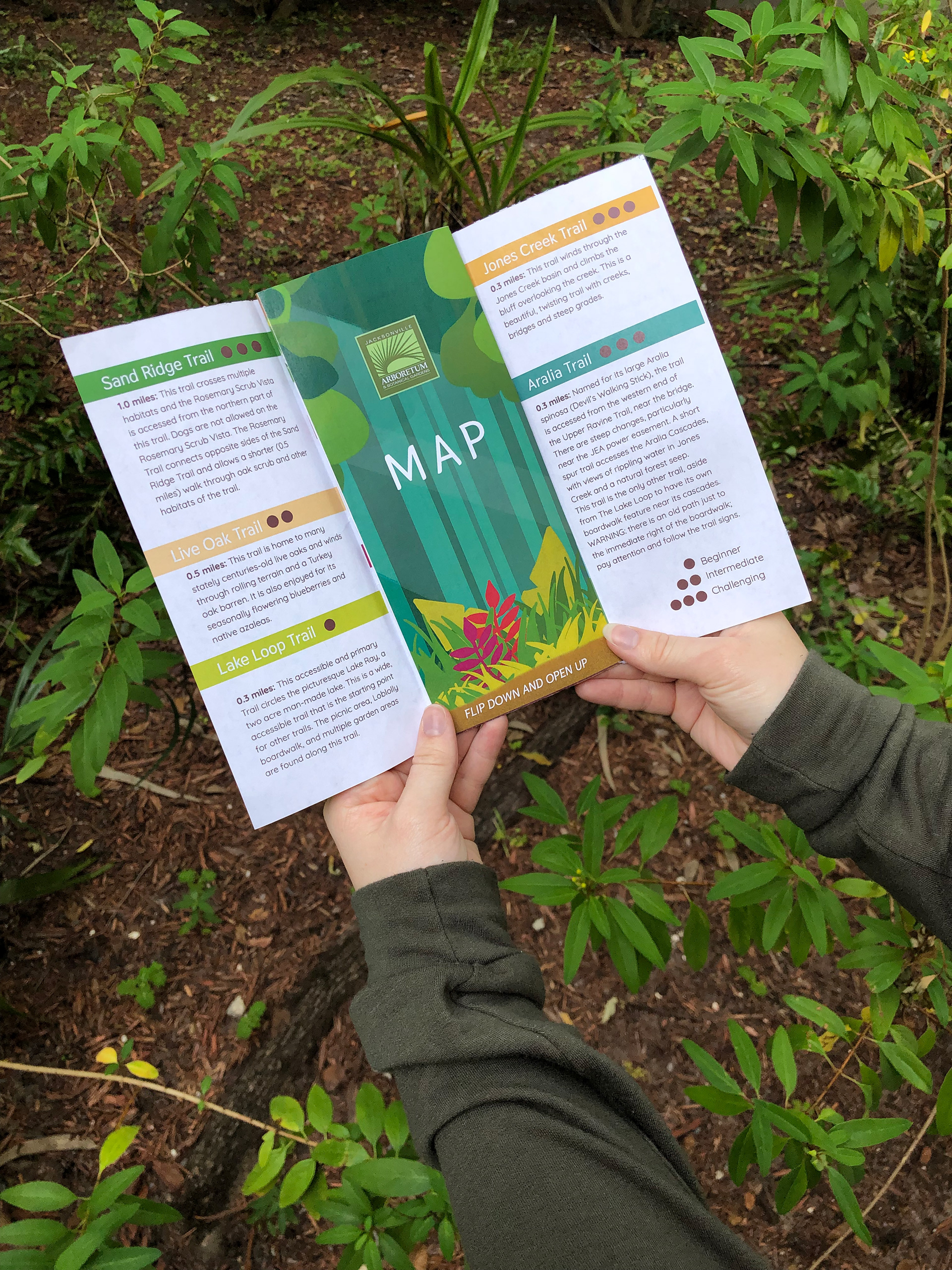
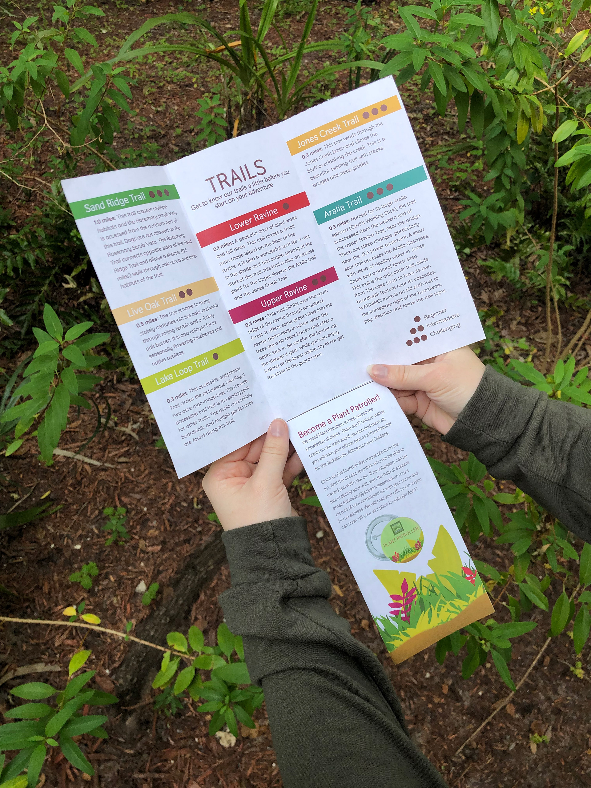
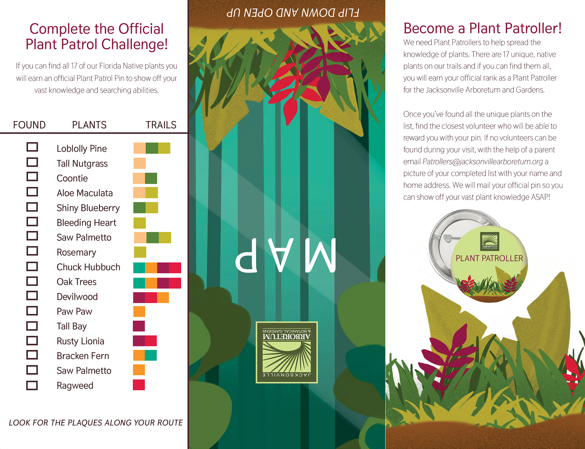
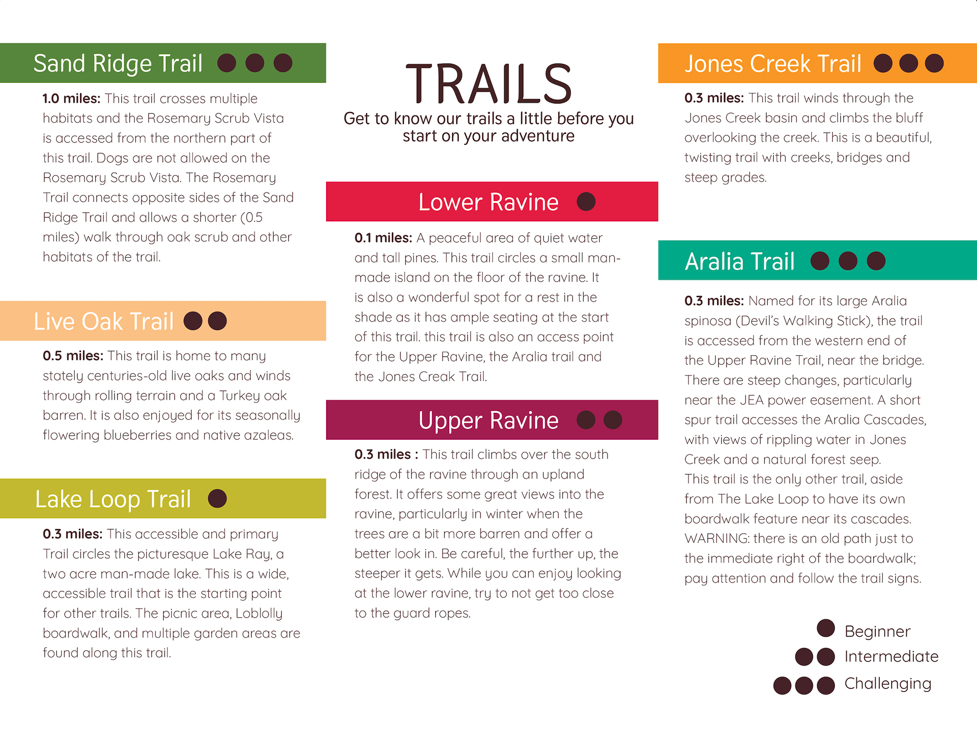
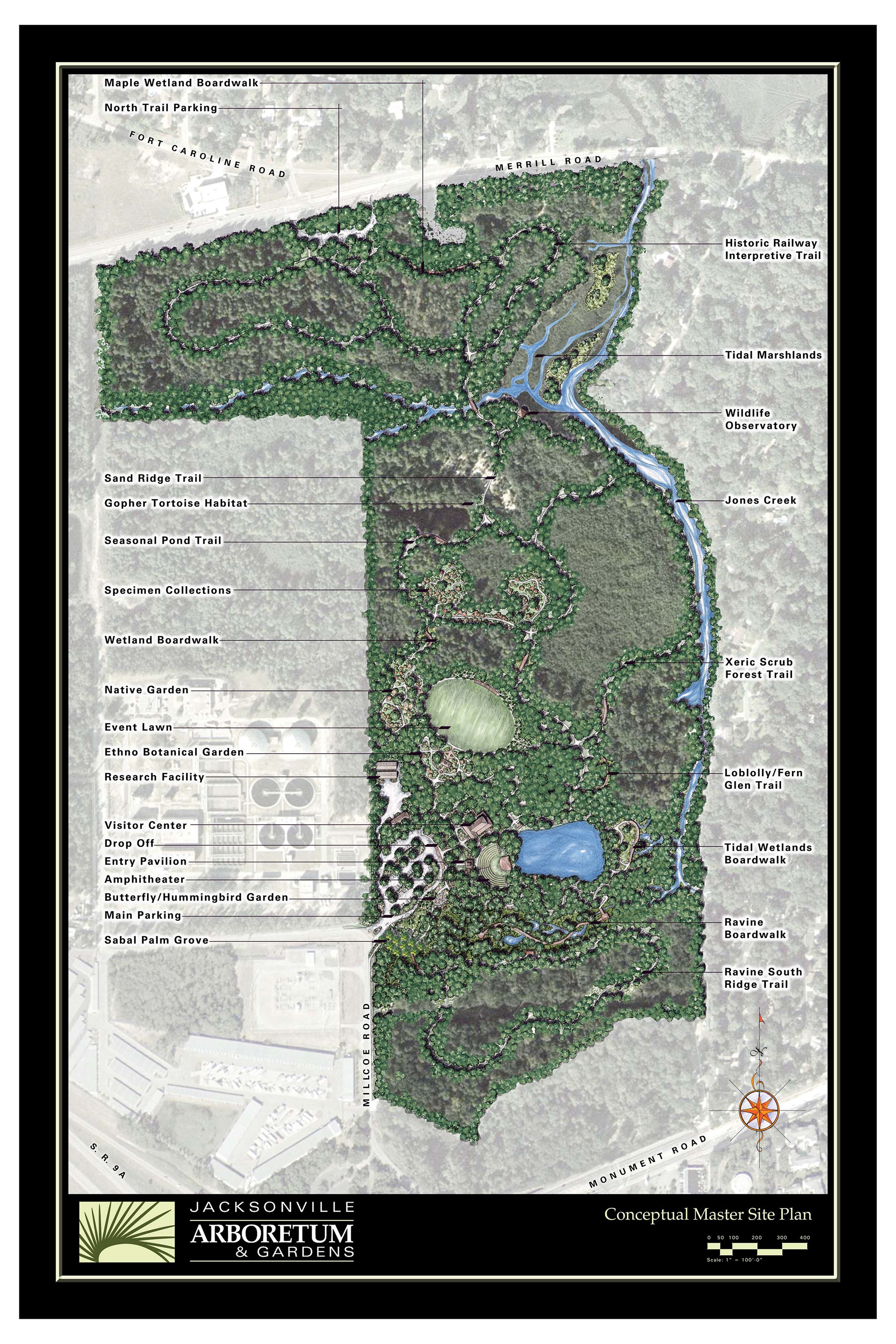
The unique format capitalizes on the use of a sheet of tabloid paper and the functionality of the brochure captures the engagement of the user. It can be folded in numerous ways depending on what needs to be accessed, but still feels comfortable to navigate. The map folds into the brochure and allows separation of information so the user can determine what they need and when in a few easy folds.
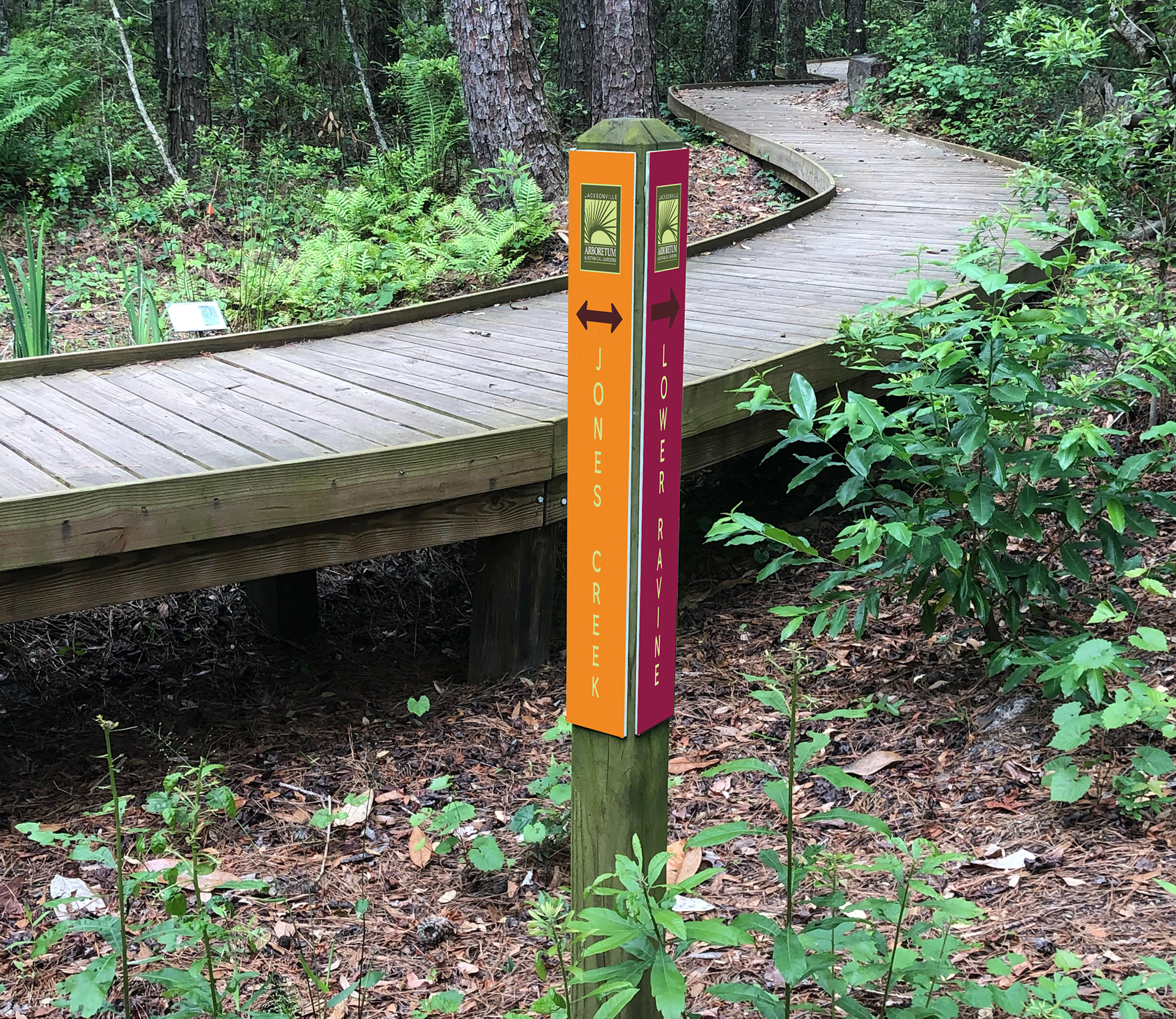

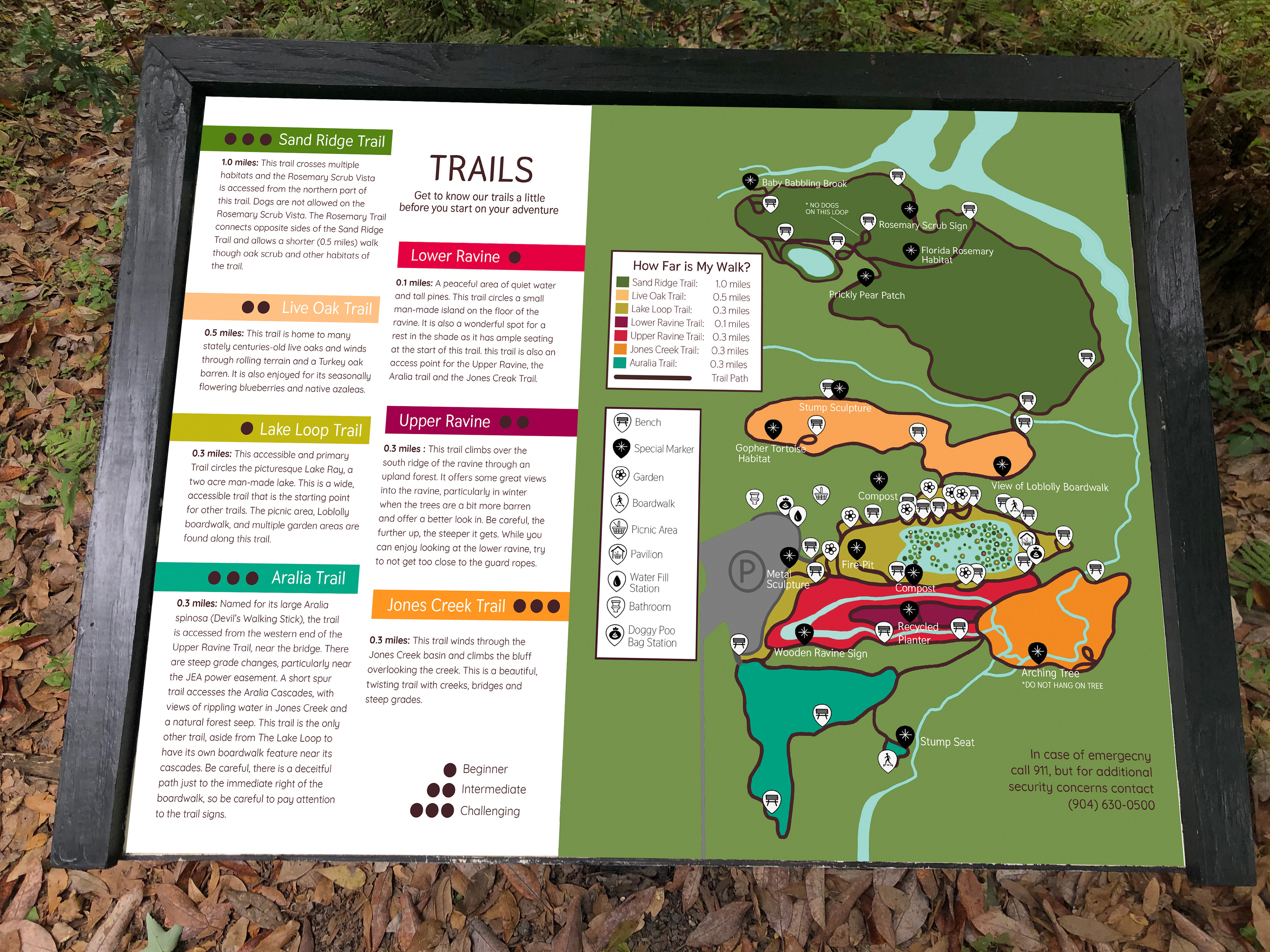
SIGNAGE & ICONS
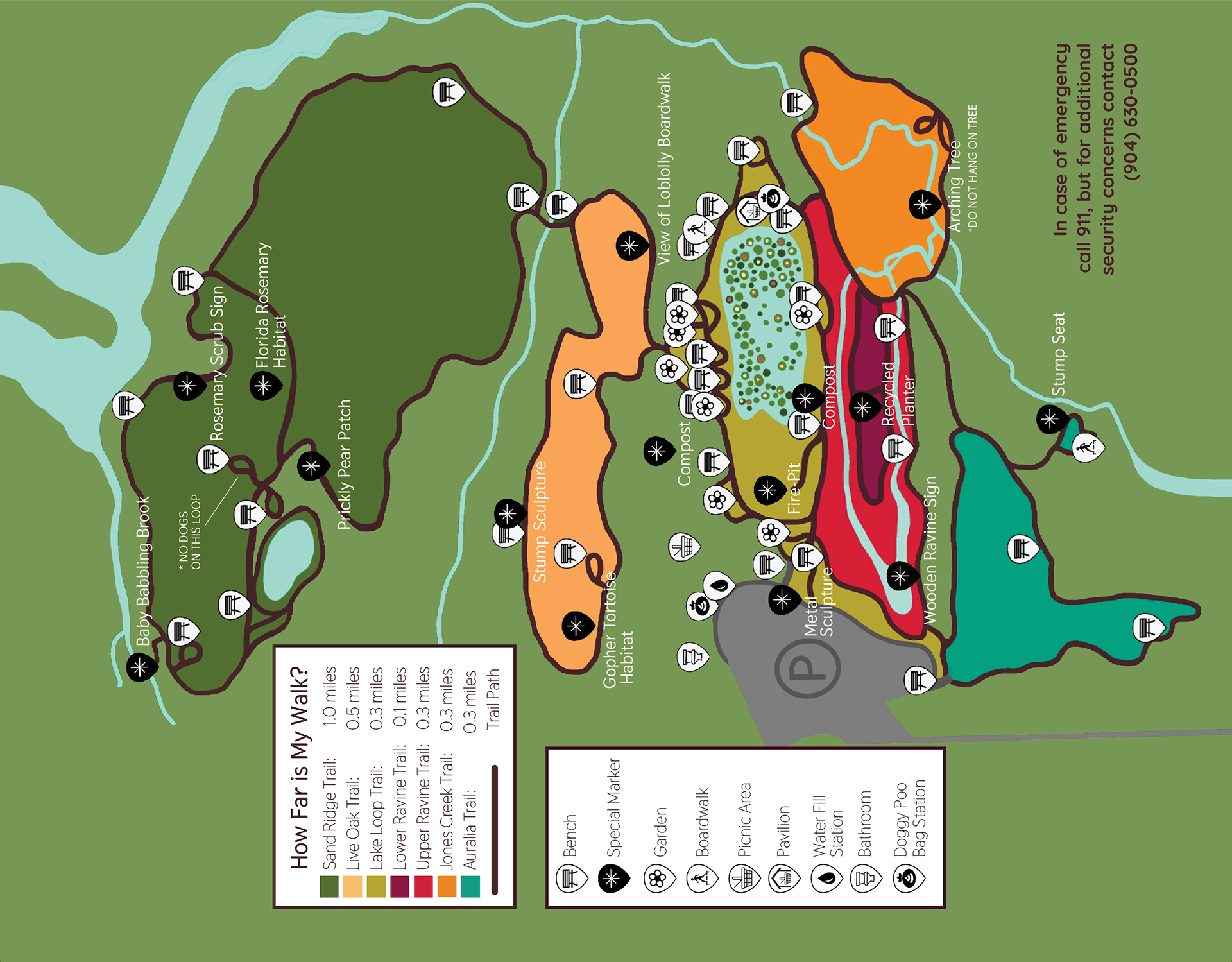
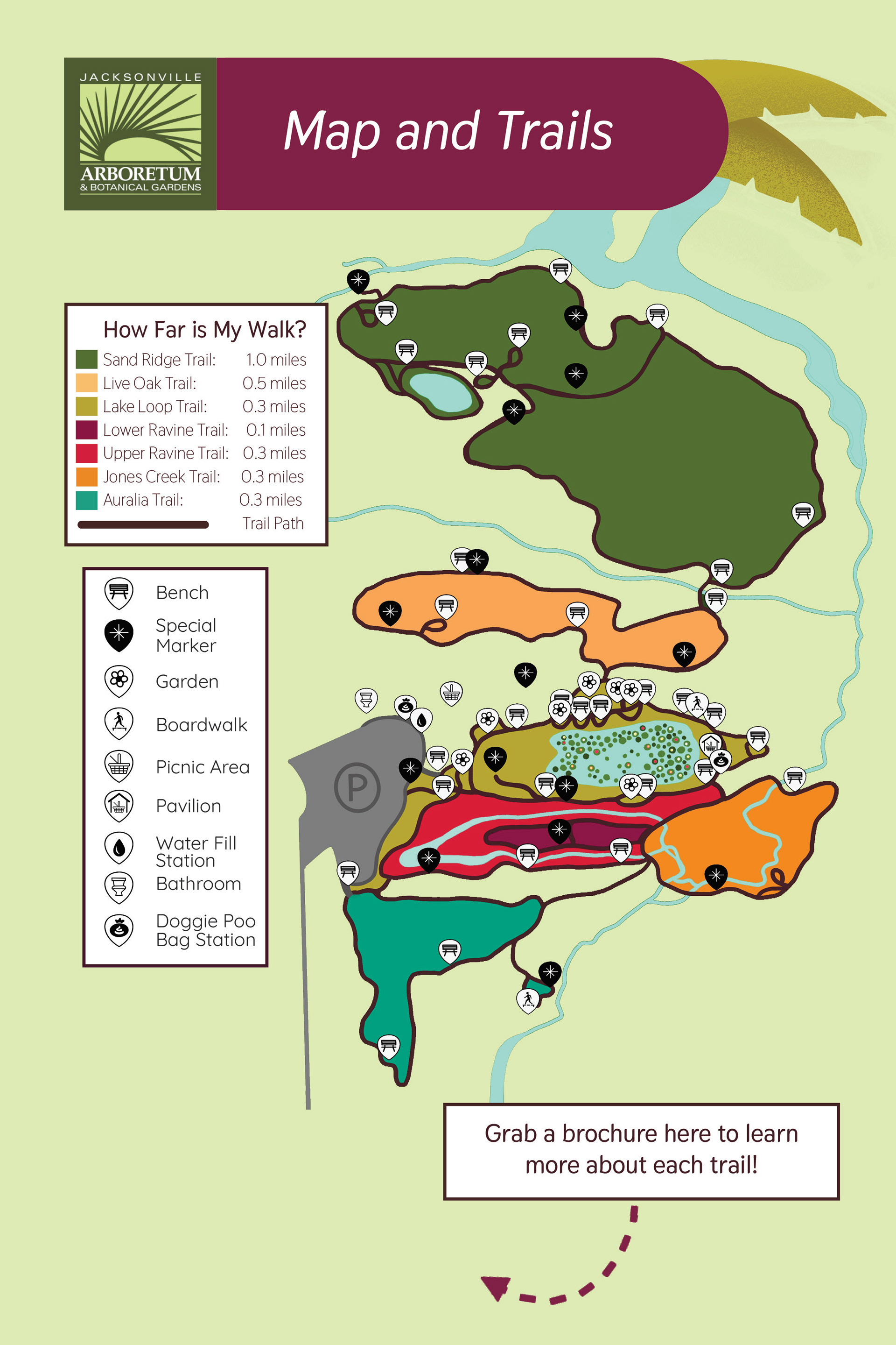
The signage in the park lend a tremendous hand in navigation along the way, as the trails are still in development in some parts and can easily cause some confusion without aid. While there are no shortage of icons in this new map design, the old map was slacking in anything navigable on the trails. The more points of interest, the better assimilated to the trails the user can be, as the arboretum is known for being a bit confusing. By walking the trails myself numerous times, I found unique points of interest to notate on the map. By doing this, it allows better trail exploration planning as you can see all your resting spots and exactly how far along they are on the trails.
ENGAGEMENT
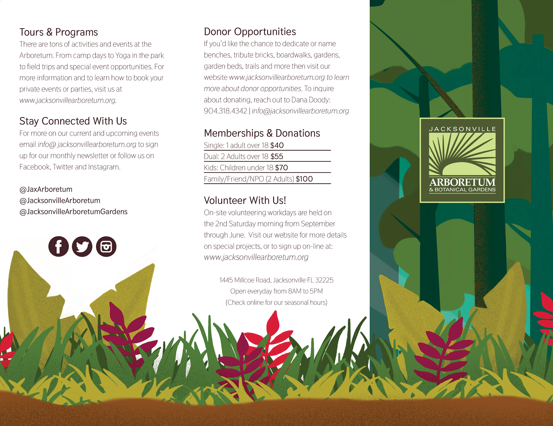
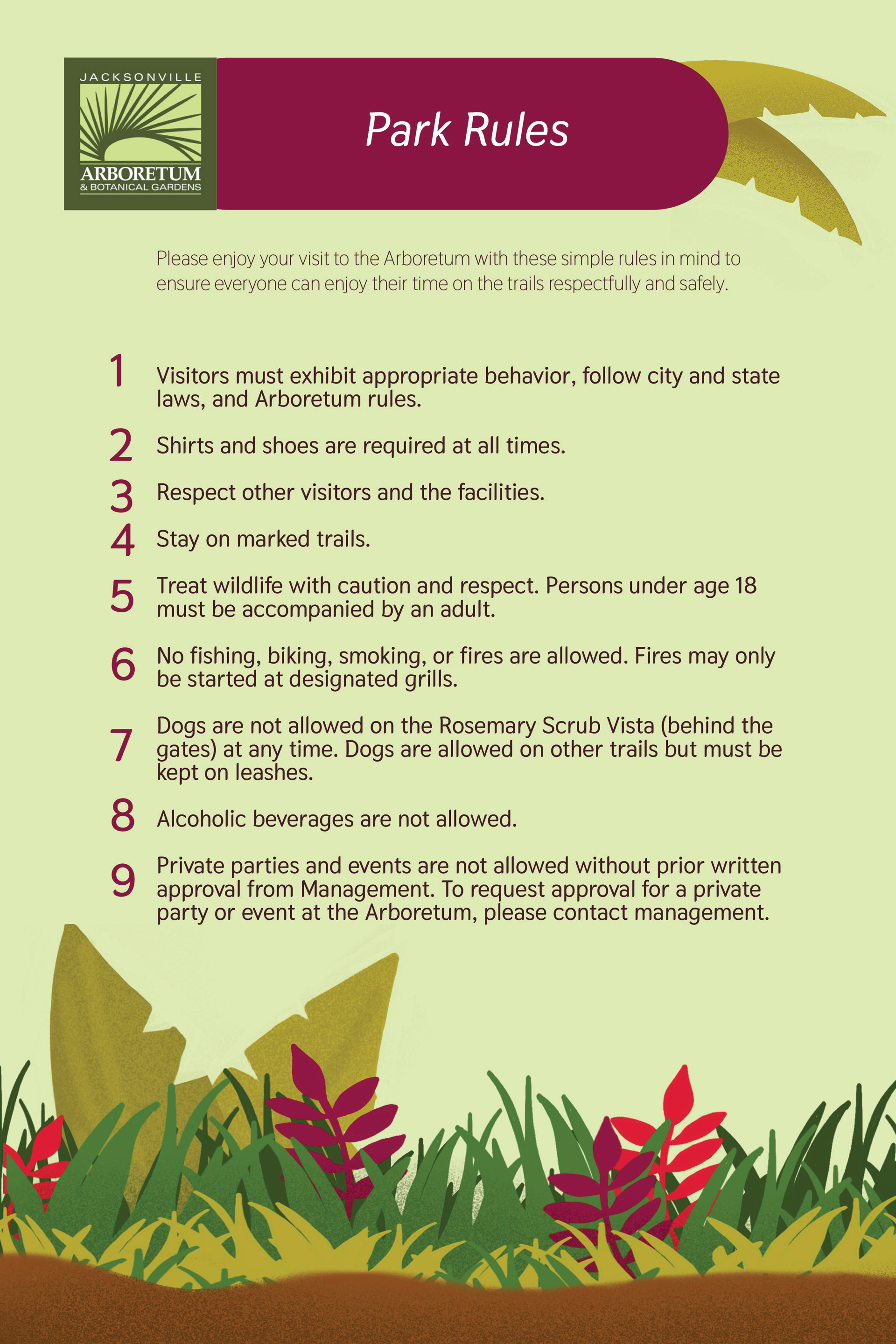
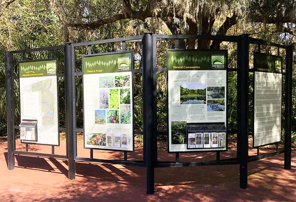
Making the images engaging and informative was imperative to the design. Not only will you see the large format map before you enter the park, but you'll see the rules and a call for donations on the history panel. It is important that people are engaging and seeing this information because the park relies on those donations. Other than the brochure, the call for donations only appears on this panel, so they have to capture gazes and draw people in to view.
PRINTABILITY
The brochure was designed to be printable on standard Tabloid paper to appeal to the desire to be money conscious, as the Arboretum is funded by donations. This way they can reprint the template based on their own needs and save on print production in the process.

TYPE SELECTION
The typeface for this brochure and poster series had to be legible over anything else. Thasadith is a humanist sans serif with rounded corners that allows a mild amount of character without taking away from legibility. The colors and illustrative elements were giving enough character without adding a decorative typeface or even a Serif face. The logo is a serif based typeset and illustrative mark and the type selection for the brochure had to pair well with it.
CURRENT DESIGN
The current design was jammed pack with information that didn't offer much insight on what can be done inside of the park or what can be seen. There are no donation links on any of the current panels, the rules are in there brochures and not on a panel to greet guests, and the map doesn't reflect water changes or changes from the volunteers clearing new areas. Accurately depicting the park is hard when it is in a state of constant change, and these dated images can no longer be captured inside by guests. While it is well maintained and lush, the water levels aren't in anyones control but nature.
