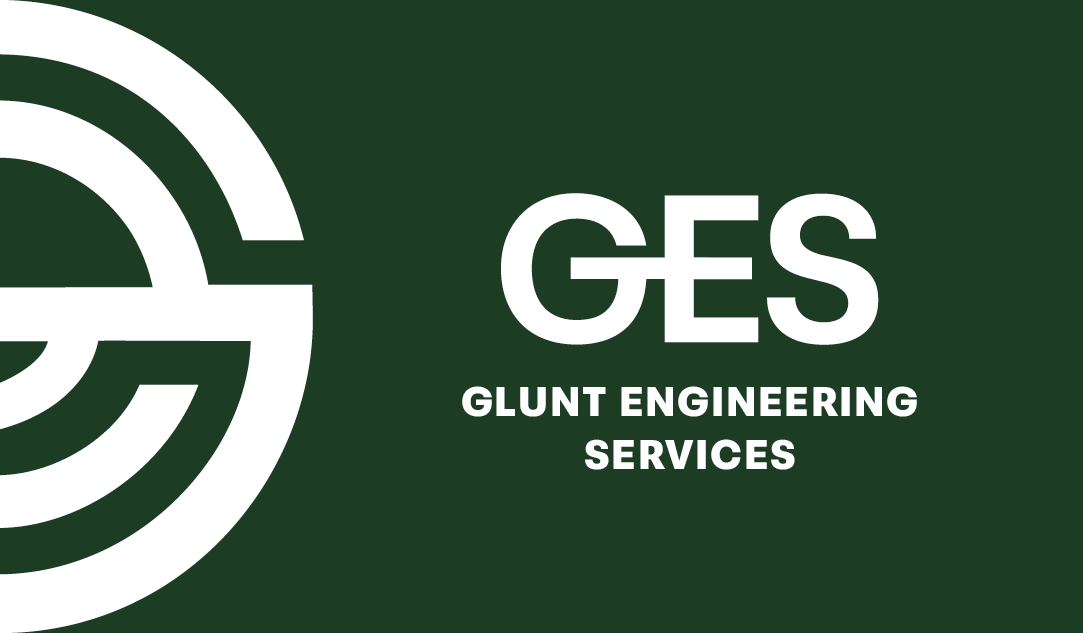
ABOUT THIS PROJECT
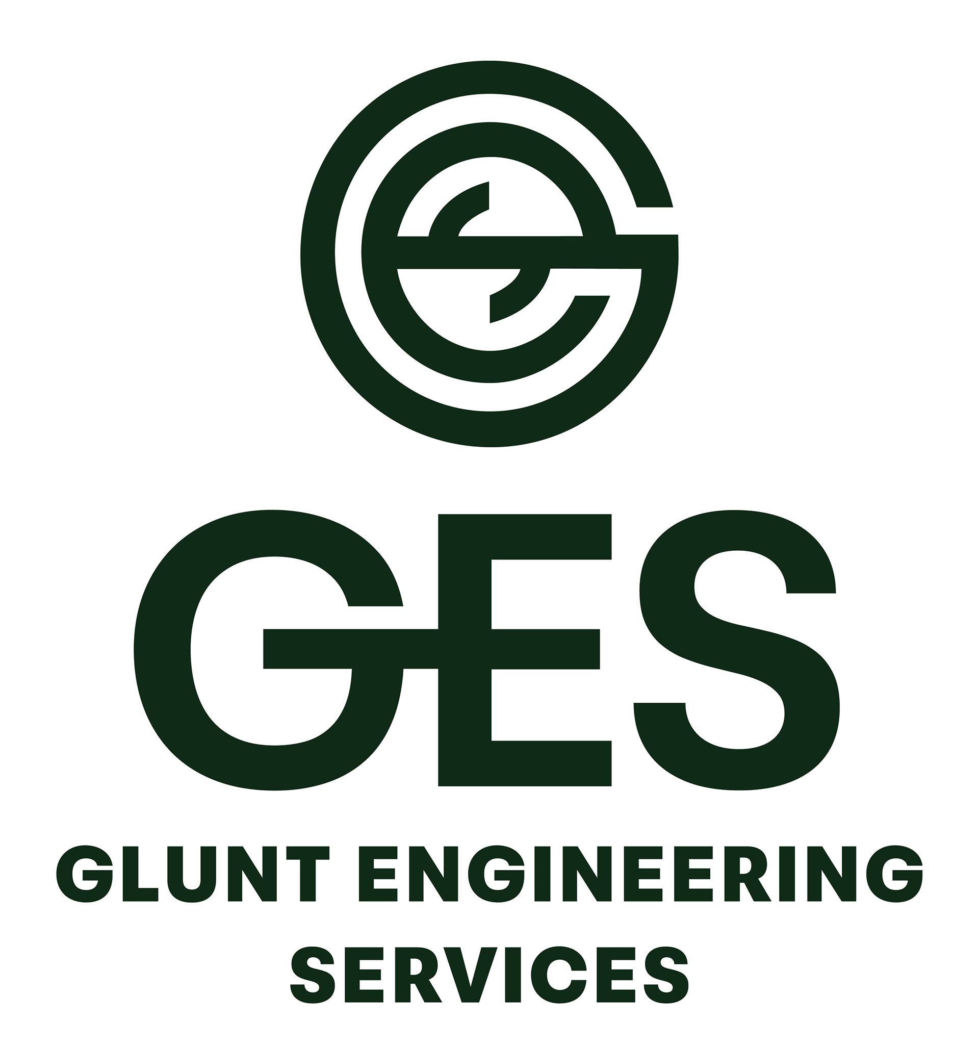
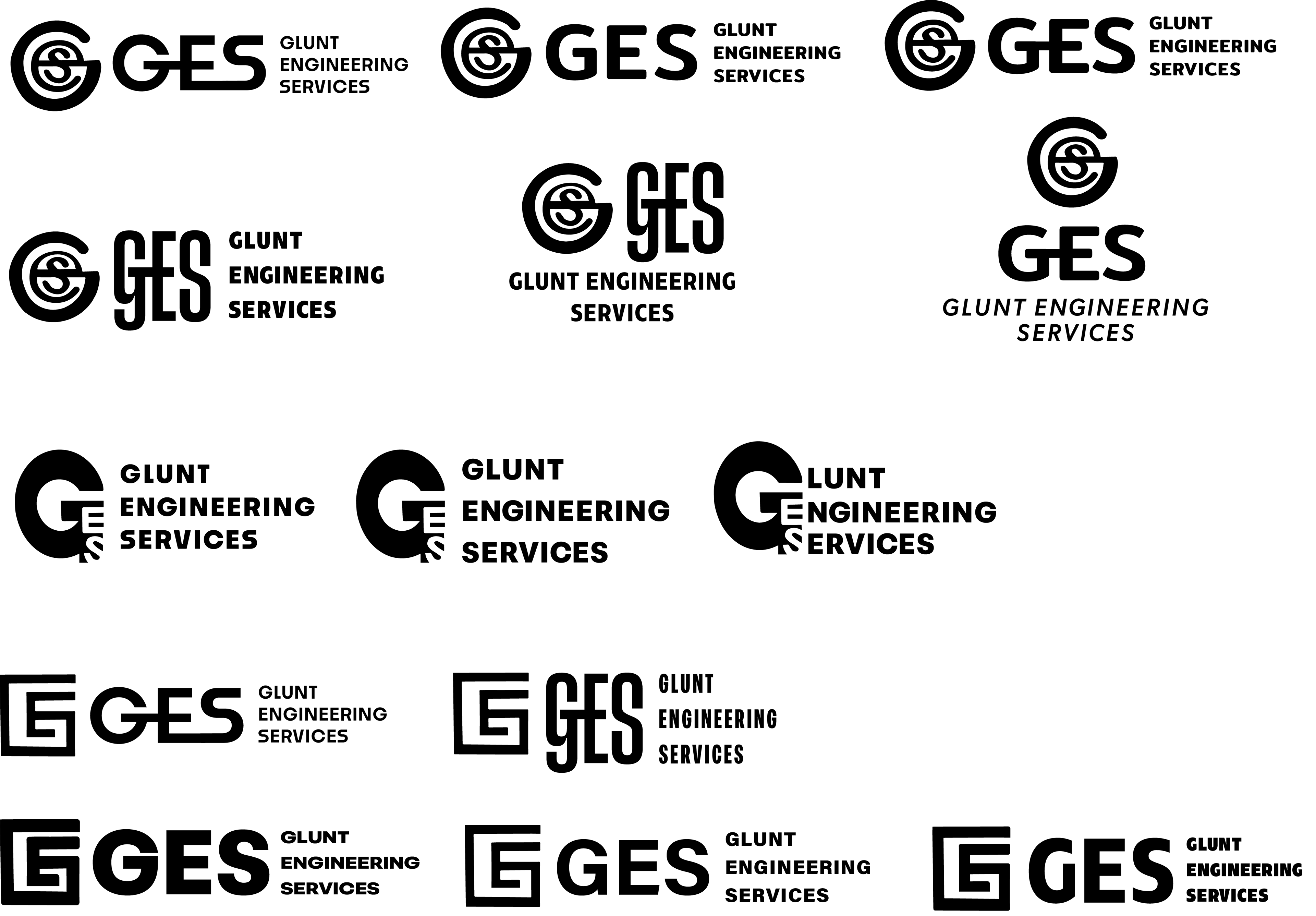
This logo was designed for Glunt Engineering Services inc., (GES) with thoughtful attention to both professional and personal significance. Every detail, from form to type, was crafted with intention, resulting in a brand identity that reflects both the precision of this profession and the values this client brings to it.


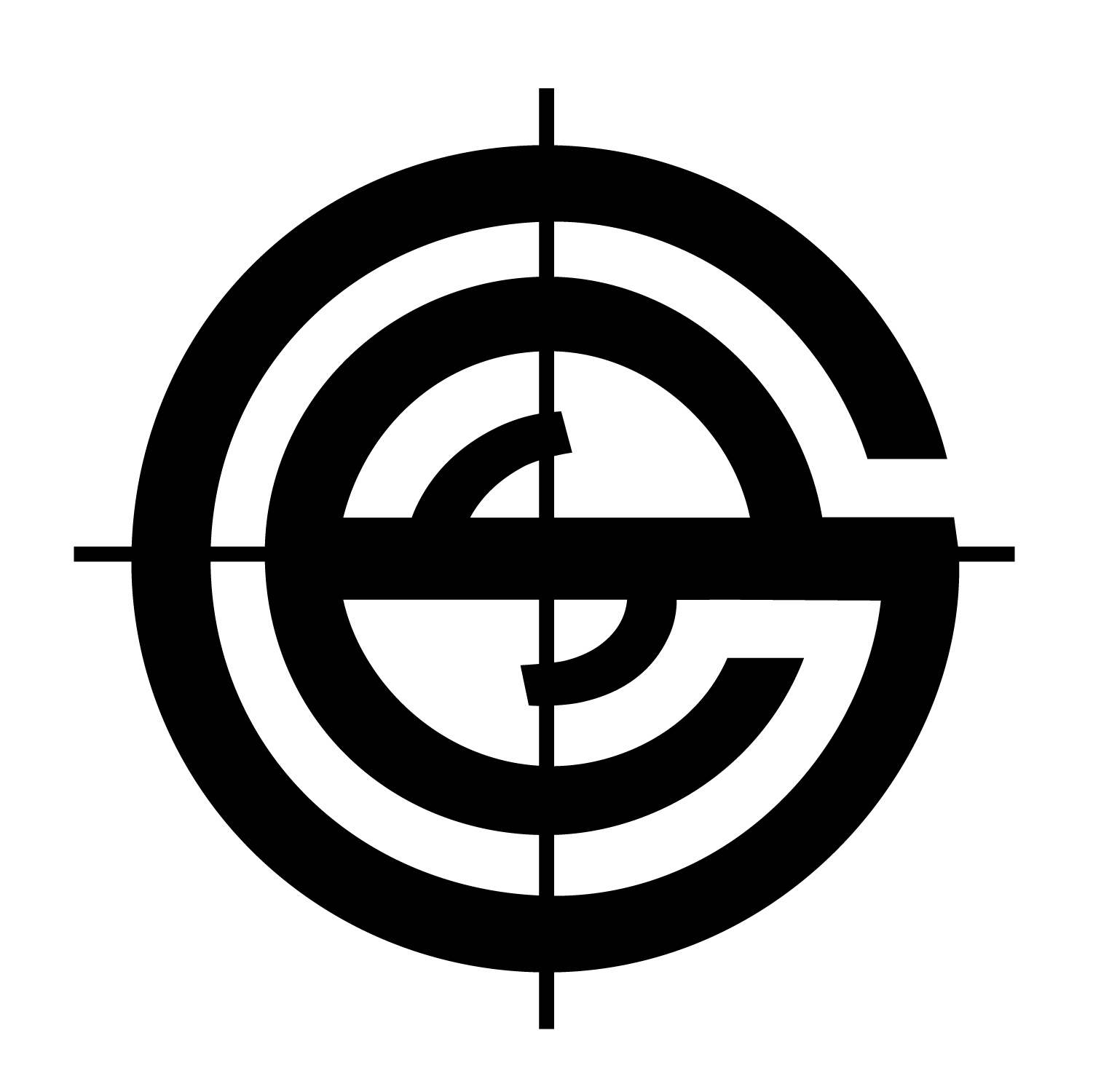
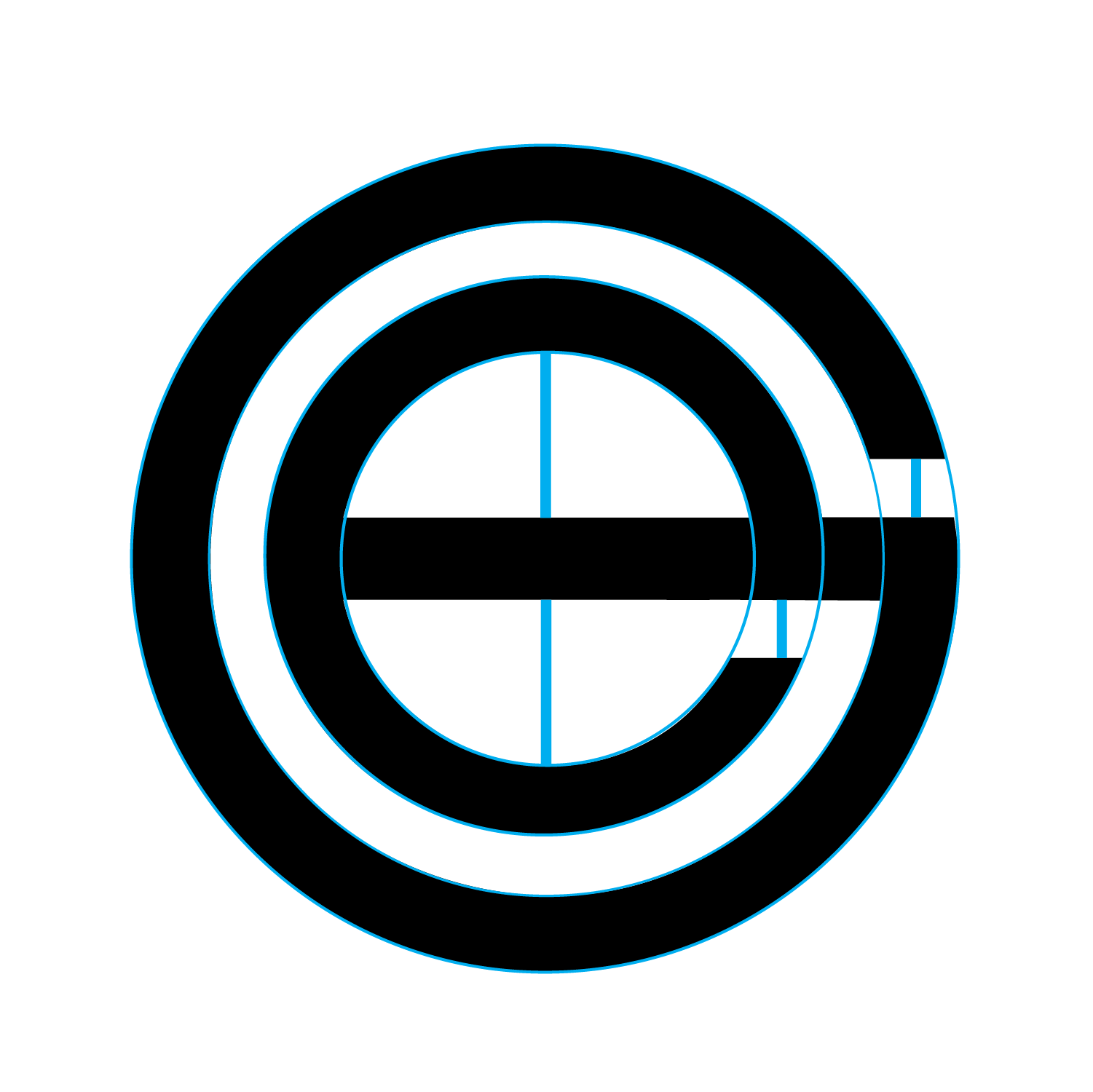
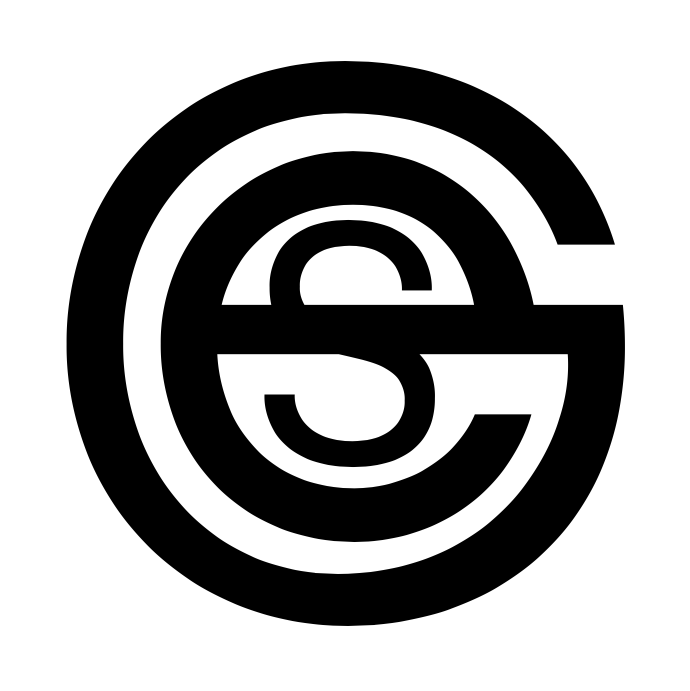
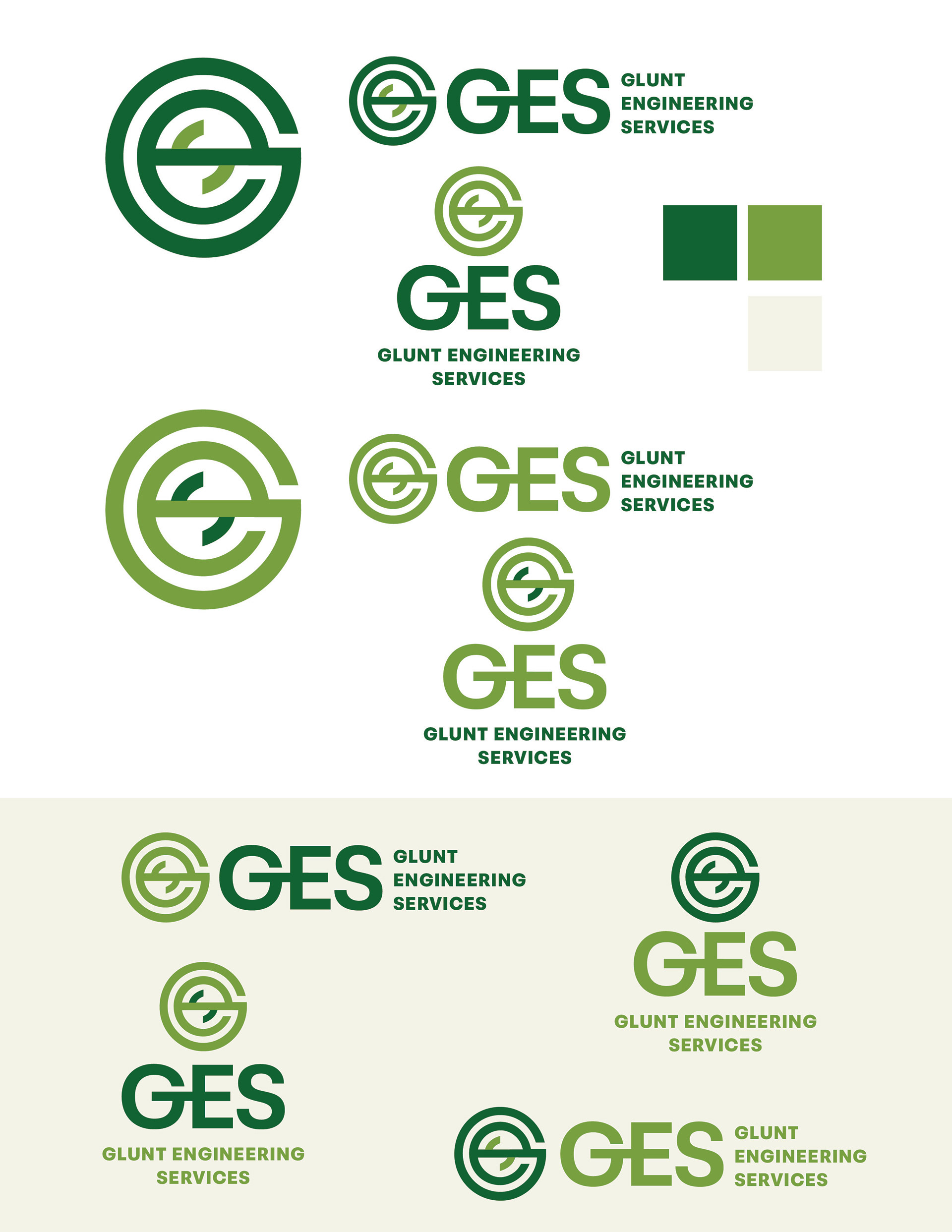
ABOUT THE MARK
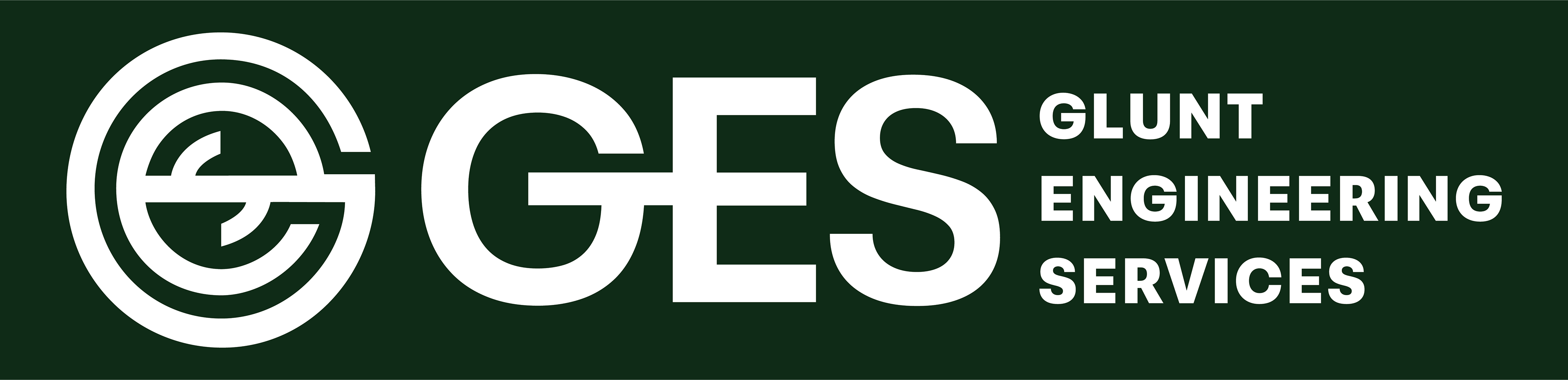
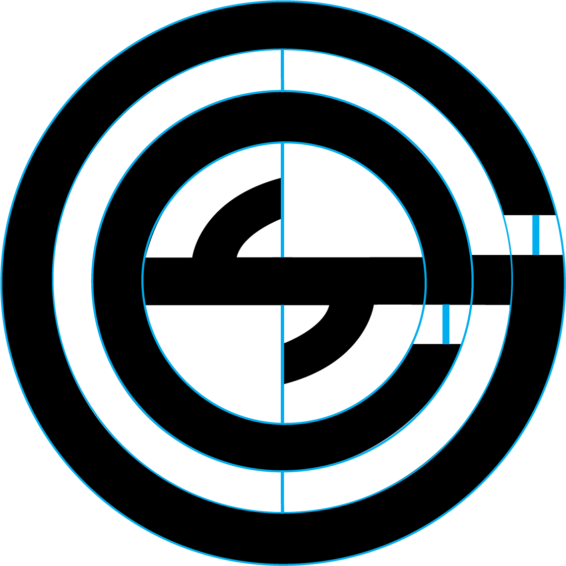
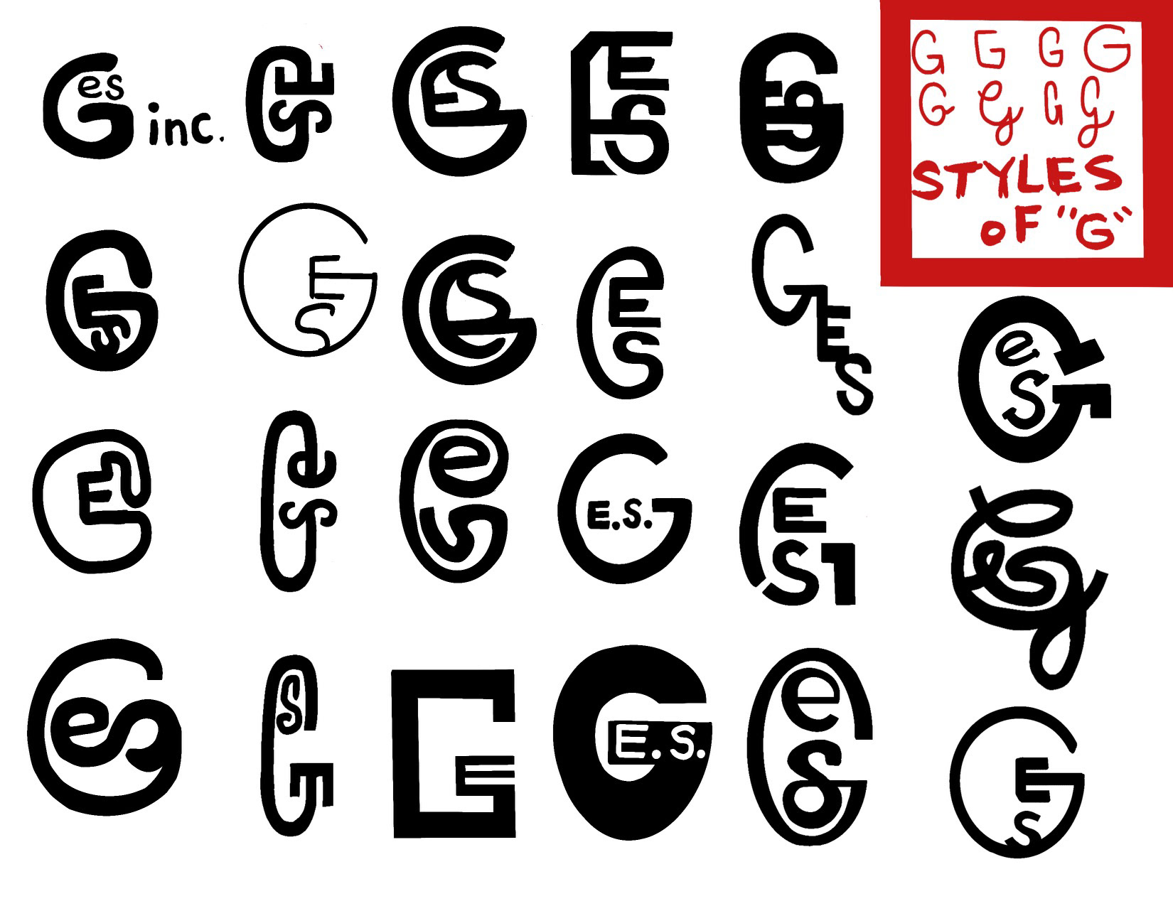
The symbol merges the letters G, E, and S into a circular form inspired by concentric circles and crosshairs, referencing both engineering precision and geometric layering. The result is a modern, structured mark that represents both the founder’s profession and personality.
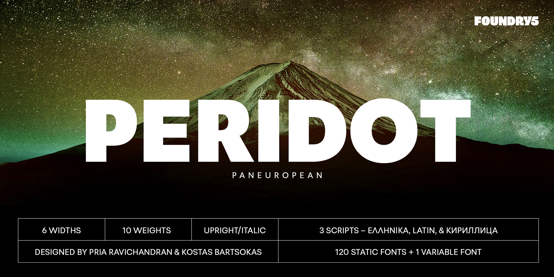
ABOUT THE TYPEFACE
The logotype uses Peridot PE Variable, selected for style, significance. and variability. The name Peridot references a green gemstone, connecting to the brand’s color and the founder’s geology background. PE stands for Professional Engineer, matching the founder’s credentials. This subtle alignment between name, career, and typeface made it a perfect fit.

Front of the Business Cards
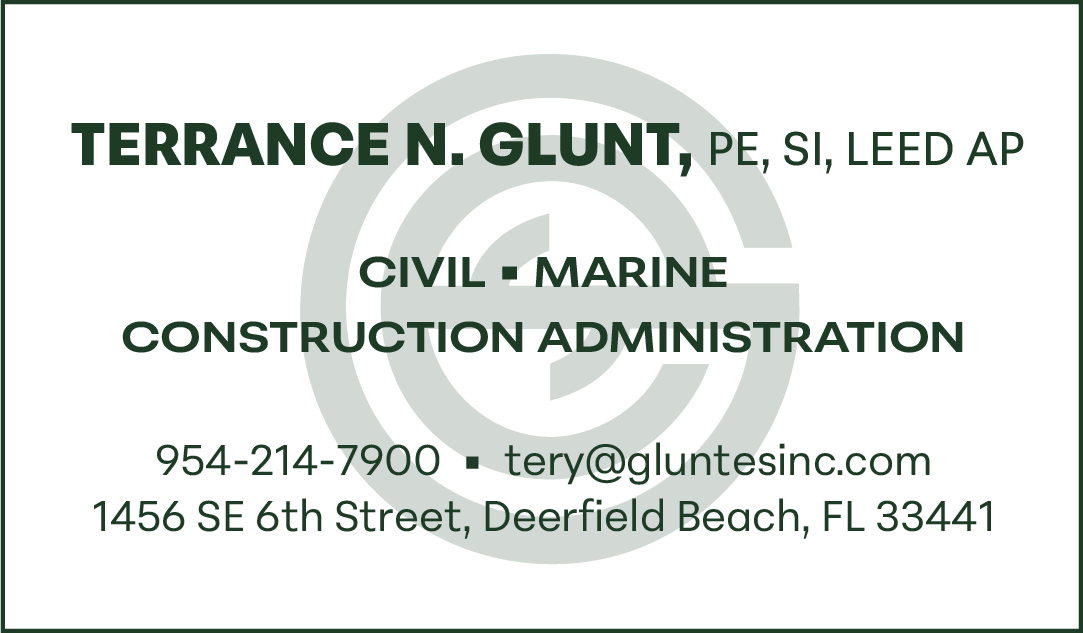
Back of the Business Cards
BUSINESS CARDS & BRAND COLOR
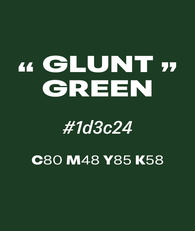
Instead of going the classic black and white route, "Glunt Green", the namesake dark forrest green color of GES, was selected for familia and personal reasons to represent GES inc.


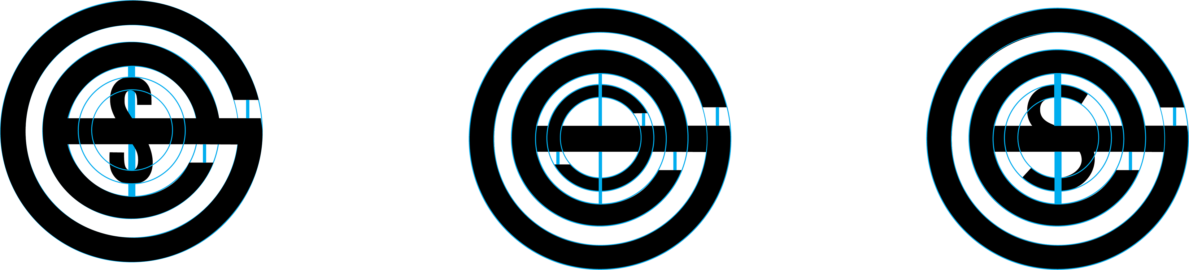
MOODBOARDS & COMPS
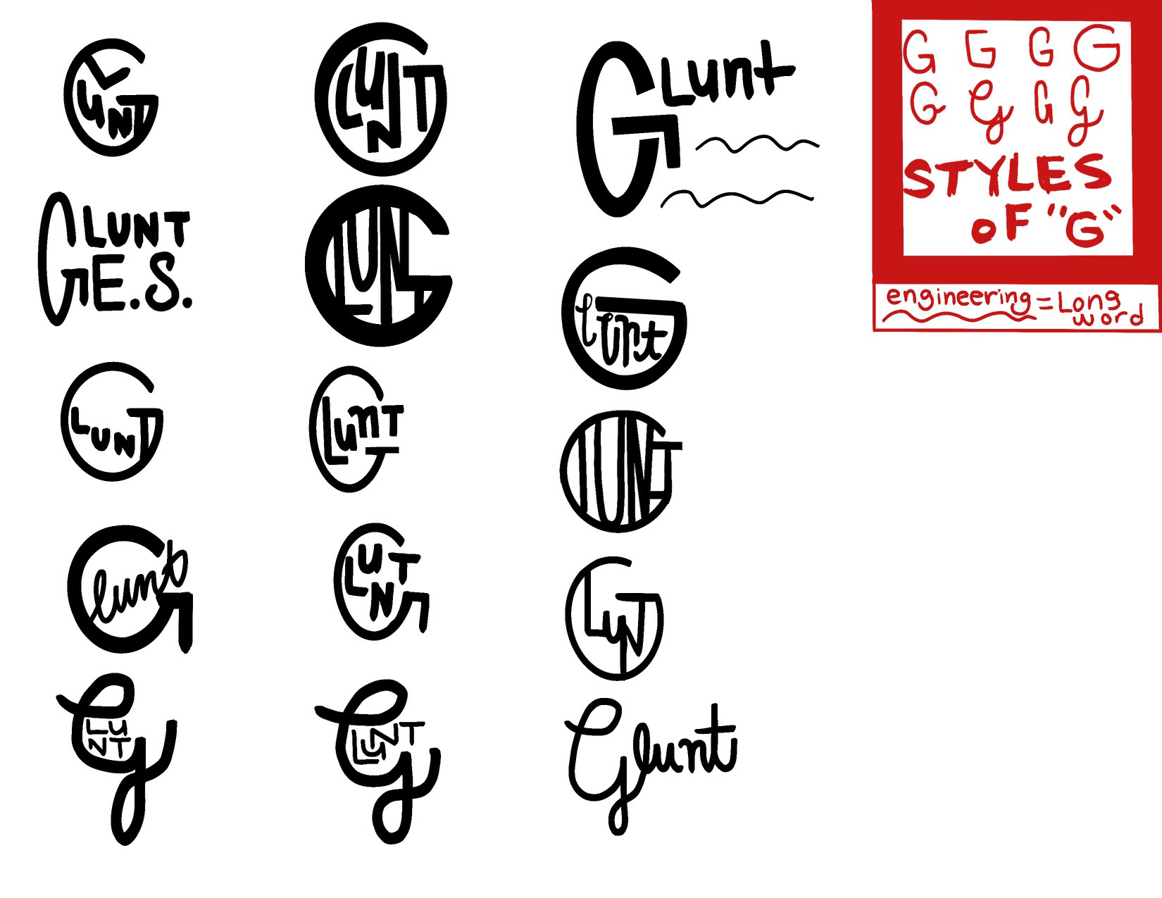
Gravitating to the professionalism and precision of one moodboard, but the flow and feel of the the other moodboard, we merged the two represented ideas to create this brand's look and feel. Merging all three letters became the main challenge when crafting the mark and honing in on measurements and concentricity helped navigate to the final logo mark used.